Tuffins


Category
DesignAbout This Project
Tuffins
Brief
Although a successful letting agency and property management company, Tuffins’ look was outdated and in need of a refresh in order to compete in its highly competitive industry.
Approach
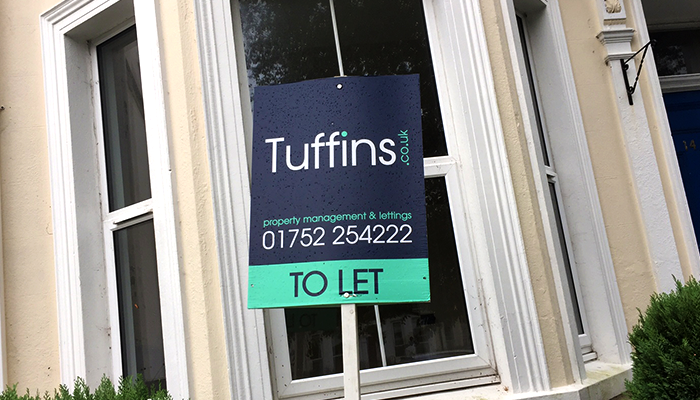
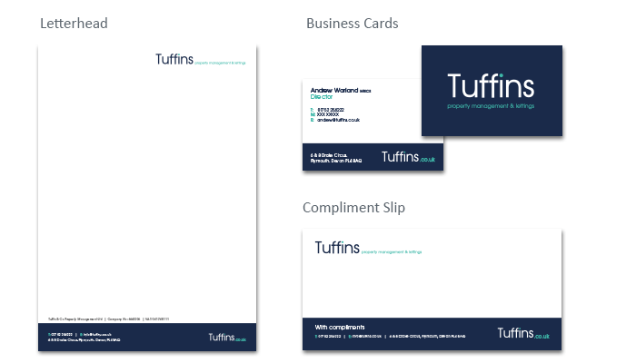
We worked on giving the brand a strong look that would stand out to potential landlords and future tenants. We trialled a few logos and colour schemes before deciding to go for a sophisticated and clean look, using a modern combination of navy and aqua to make the design pop. We applied the logo to new stationery and signage, bringing the company firmly into the 21st century.
Result
From their company car to their signage, the final brand was versatile and easily applied to all their marketing material. We designed matching stationery and ‘to let’ boards to complete the project. The team were really happy with the final look, which has helped boost their confidence when moving forward with new business.


